Therapist is the first portable magnetotherapy device

Introduction
(00)
Info
Website
Registered design
Services
Team
Matteo Fioravanzo Studio
Beatrice Piccoli
Initial challenge
(01)
The challenge that Amel Medical presented to us was to create a new magnetotherapy device that would change the way therapy is performed.
Starting from a new patented technology, we needed to create the right medical device (small in size) that would express the new functions and performance, and best meet the needs of the identified target users.
Technology
(02)
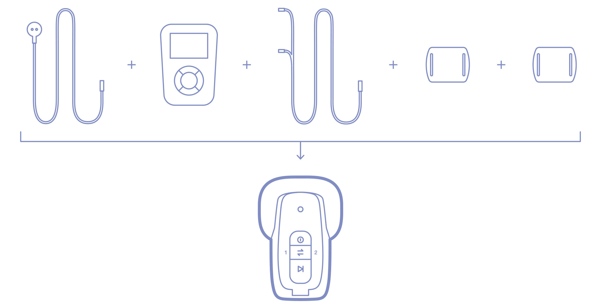
Common magnetotherapy devices consist of a main unit, connected to applicators that are placed directly on the painful area.
The new patented technology allows these two components to be combined into a single device.
The device is simplified and smaller, and most importantly it allows the user to undergo therapy while on the move. From this technological evolution came the client’s request to make the device wearable and practical to use.
Product design
(03)
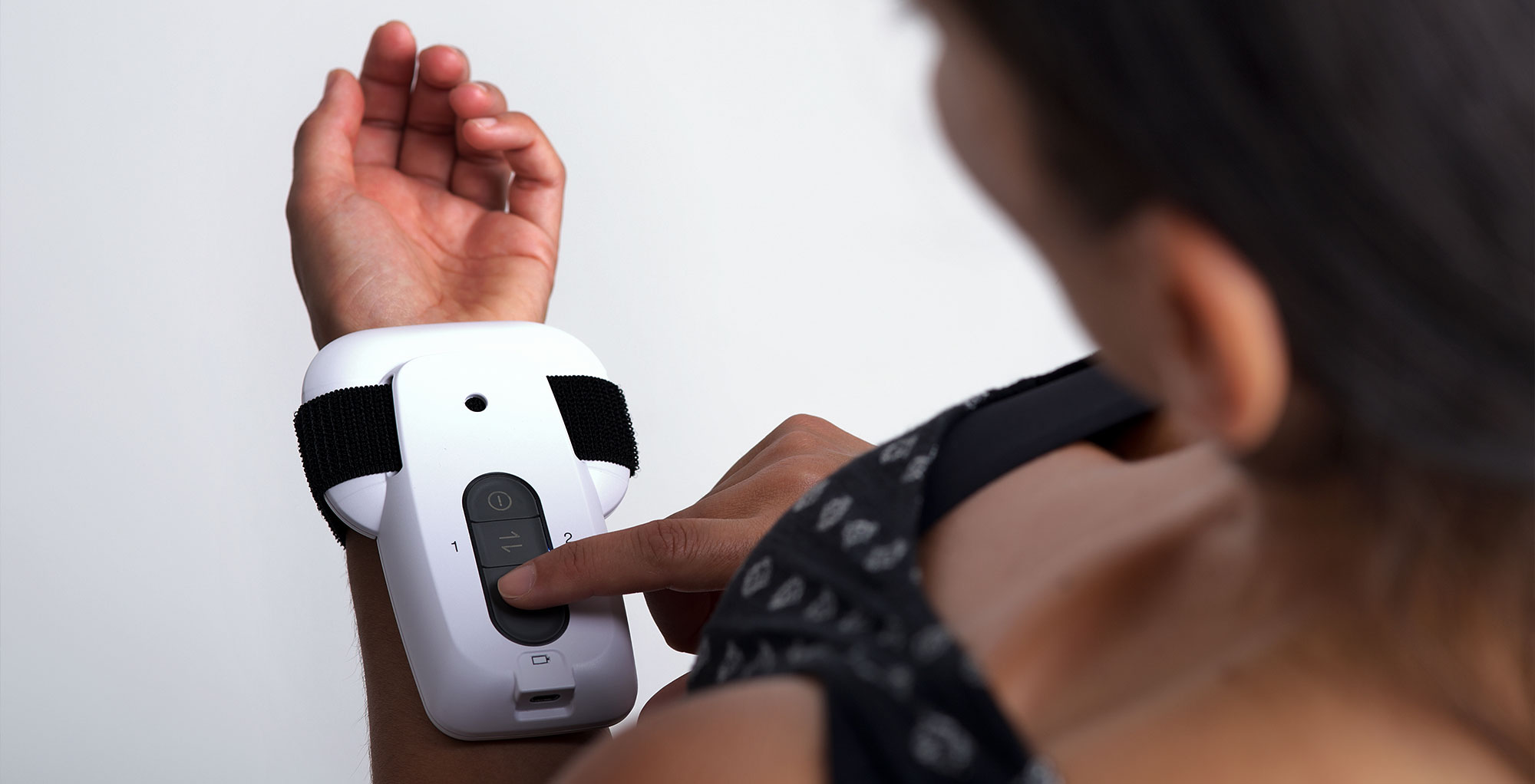
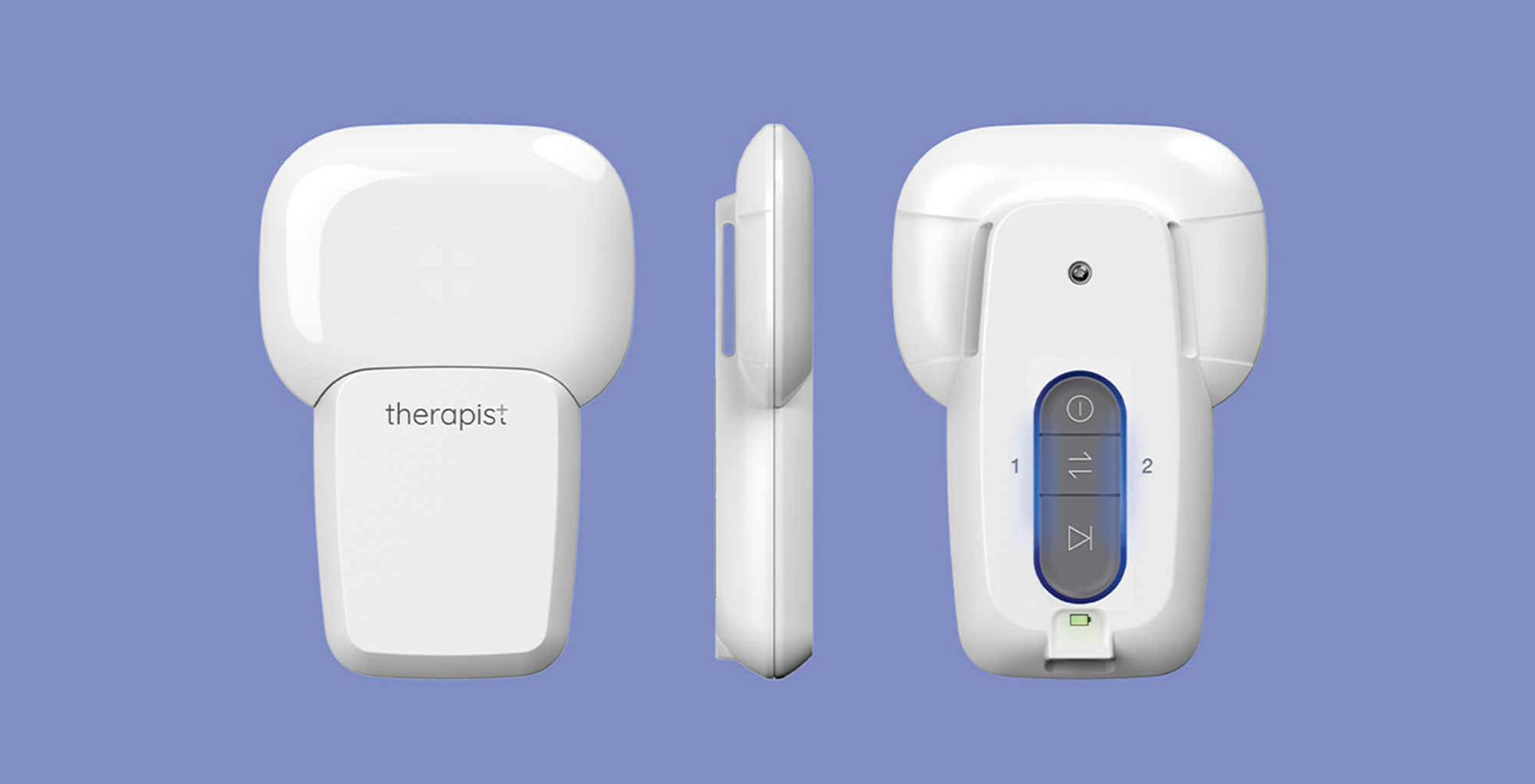
The product design focuses on highlighting its compact size to enhance both its wearability and ease of use.
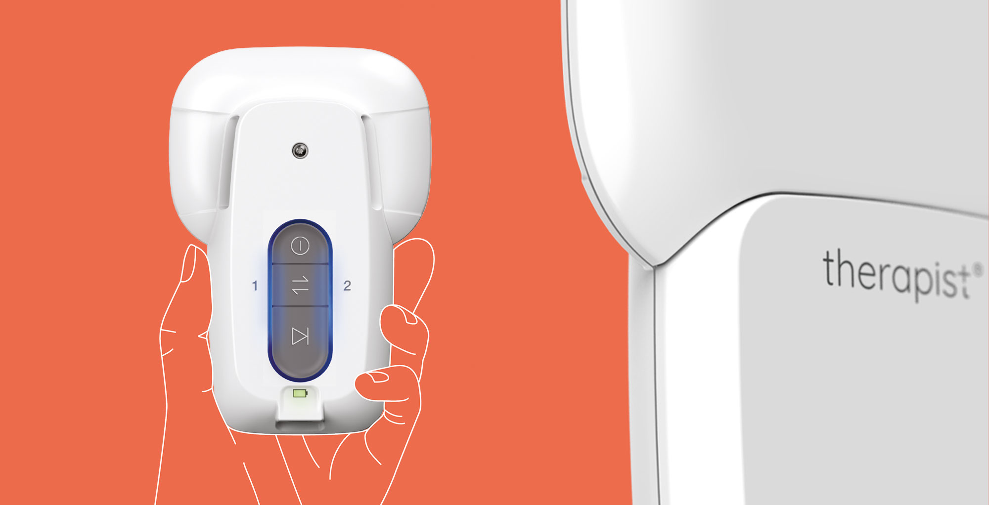
The novelty of the all-in-one patent is encapsulated and enhanced by the bi-directionality of the product, which distinguishes the two main functional areas: one side for therapy and the other for the interface.
The style provides recognizability while remaining neutral, which is essential for a device suitable for a wide target audience (from athletes to the elderly).
Visual identity
(04)
Identity
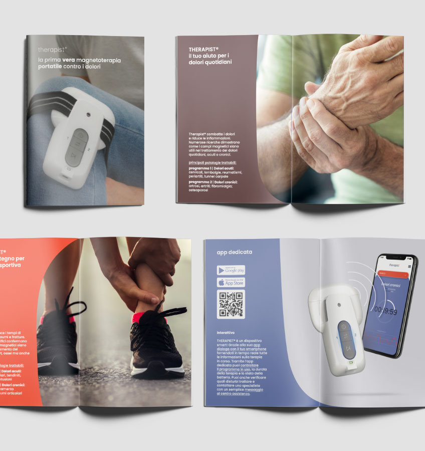
Therapist is not only a device, it has also become a brand. The feature of being able to do magnetotherapy even on the move makes Therapist a device that will appeal to a broader target audience, particularly young people and athletes. The brand’s visual identity aims to enhance and convey a sense of dynamism and simplicity.
Graphic concept
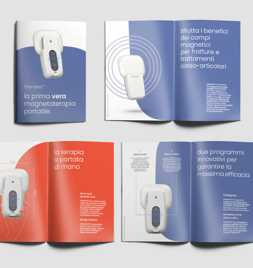
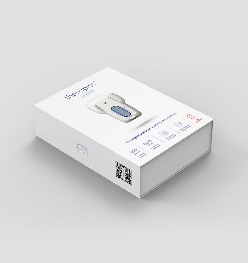
The Therapist layout was used as the unifying graphic element of the entire graphic coordination. In addition to the iconic shape of the Therapist, a new graphic language has been chosen: dynamic, colorful, and energetic. The aim was to create a new positioning, even in terms of communication, in the landscape of medical devices for magnetotherapy.
User’s manual
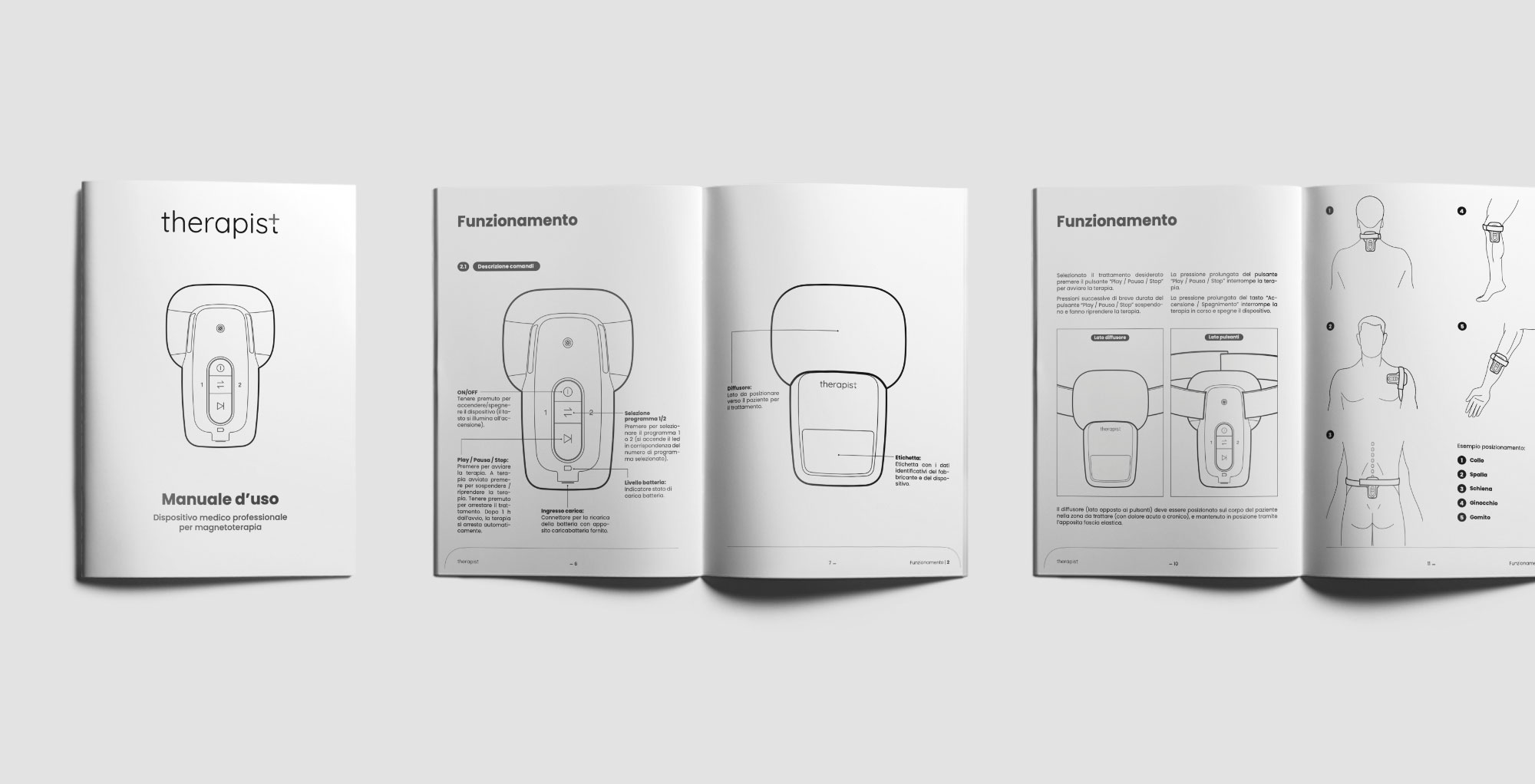
In this project, we didn’t want to leave anything to chance, not even the manual that explains to the user how to use it. Also in this case, simplicity and readability were the foundation of our design, aiming to guide the user step by step in understanding the device, the interface, and its possible uses.
Product interface
(05)
Physical interface
The must-have interface: simplicity.
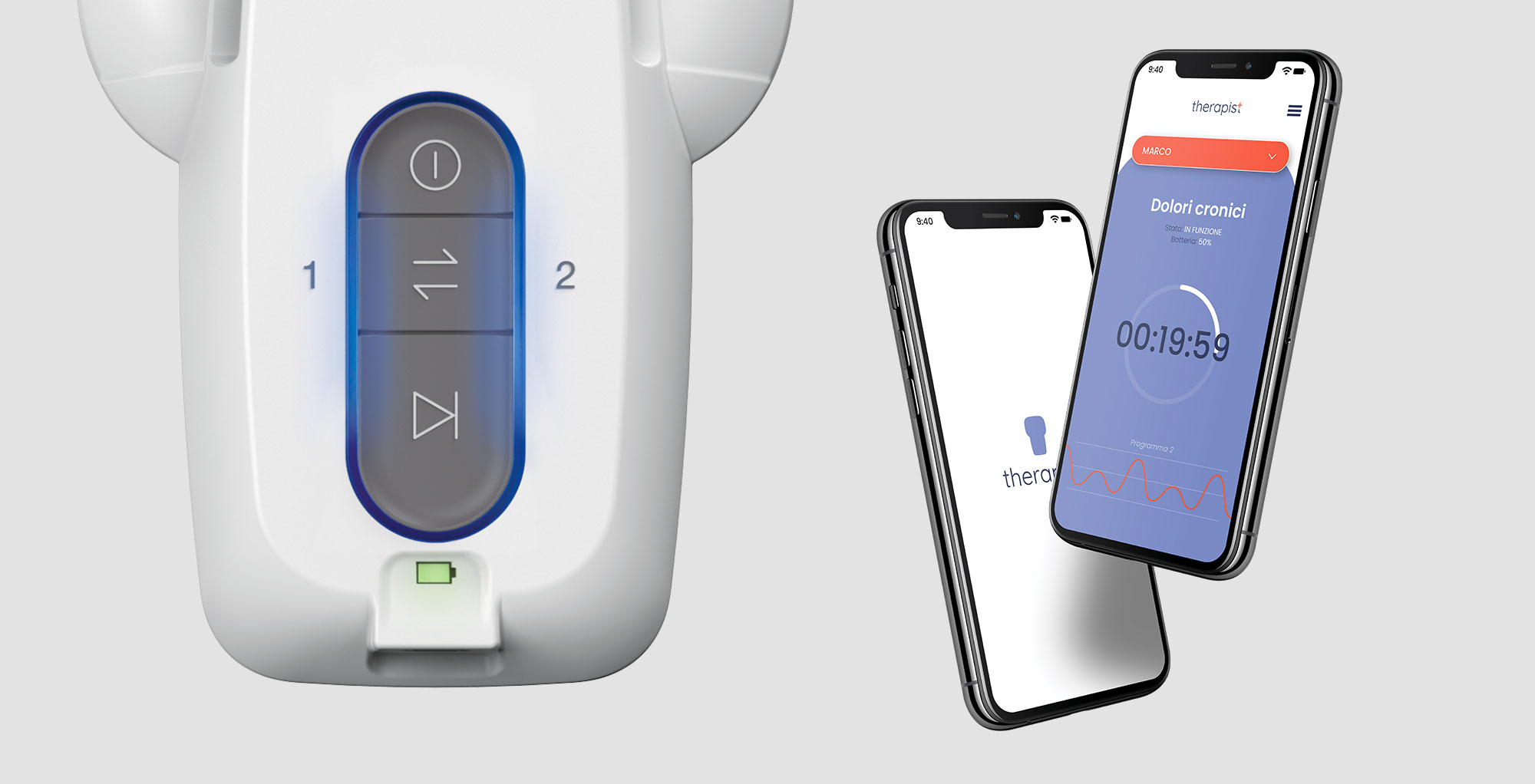
Despite its simplicity, one of the peculiarities of magnetotherapy is the absence of auditory or visual feedback during therapy. This factor led us to emphasize, through LEDs, the pulsation of the magnetic waves in order to provide the user with feedback on usage.
App
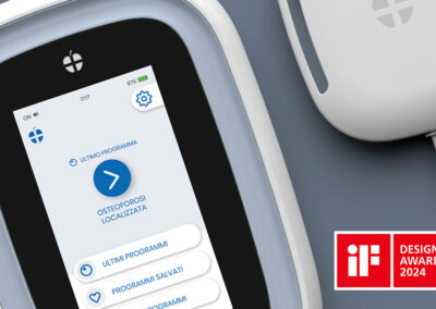
The UX/UI of this device was designed in parallel, considering a dual interface (physical and digital) to facilitate the overall use of the device. The app allows you to monitor the ongoing therapy and even visualize the therapy of multiple devices simultaneously.
The UI of the app is inspired by the rest of the communication, thus creating a complete and coherent coordination.
Management
(06)
This project involved many professional entities collaborating over a period of 2 years. It was interesting and stimulating to coordinate its development and ensure that this device could enter the market creating a strong impact, with the right design compromises, but without ever losing its strength and innovation.
Credits
Rendering, illustrations, mockups: Nui Design Team
Device photo: Meedya

