Vasar talks about being green through rebranding and the new Equa line

Introduction
(00)
Info
Website
Services
Team
Matteo Fioravanzo Studio
Beatrice Piccoli
Alessandro Rea
Initial challenge
(01)
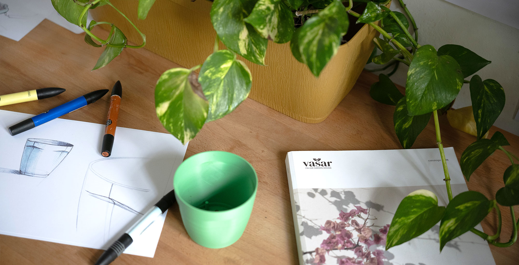
The client’s request was to create a new line of pots and rebrand the company, aligning everything towards a perspective of sustainability to meet the new market needs.
The topic of sustainability is one we are committed to addressing with seriousness and transparency, avoiding the promotion of greenwashing actions that lack genuine substance.
With Vasar, we were pleasantly surprised to find a wealth of data and actions that had been implemented for some time, making the brand an excellent candidate for this type of communication.
A sincere rebranding
(02)
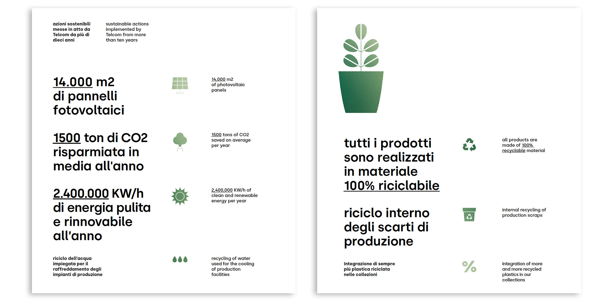
For years, the company Telcom has been applying sustainability criteria with regard to people and the territory, as well as in decisions that affect the environment.
Given that the products are made of plastic, attention to these issues has become crucial. However, during the project, we discovered that the client had been attentive to these concerns for a long time; the challenge was that it wasn’t being communicated effectively.
A window on Vasar
(03)
After the analysis, we understood that Vasar had never truly showcased all its qualities. This realization became the starting point for us to construct the brand’s new narrative:
Vasar tells its green story by showing actions already taken, new ones, and future ones,and invites us to look inside, behind, and beyond, opening a window into itself and its commitment, both as it is now and as it will evolve..
Equa line
(04)
The first output of this brand change process was the design of the new Equa line.
The intention was to create a line of vases that embodied the new values chosen for the brand and marked a turning point for the market in which it operates. These new vases are made from second-life plastic, are fully recyclable, and are produced using renewable energy.
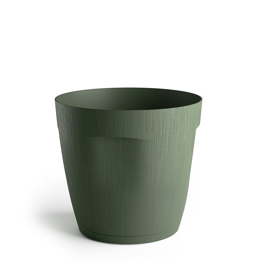
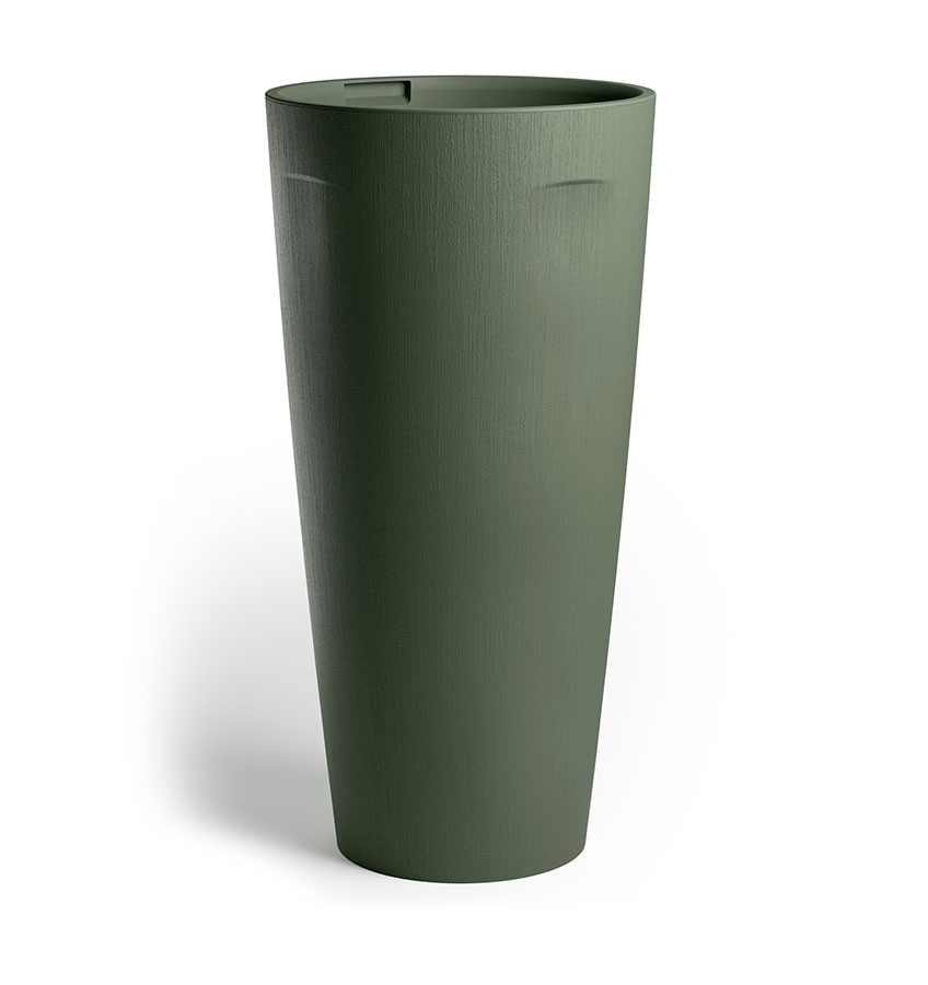
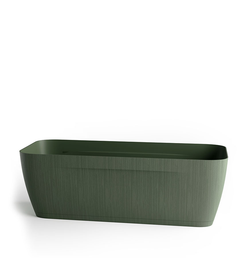
What shape does sustainability take?
So far, the market’s response has been to offer lines of vases with pure and basic shapes. But does sustainability have to be “basic,” or can it have its own form? And if so, which one?
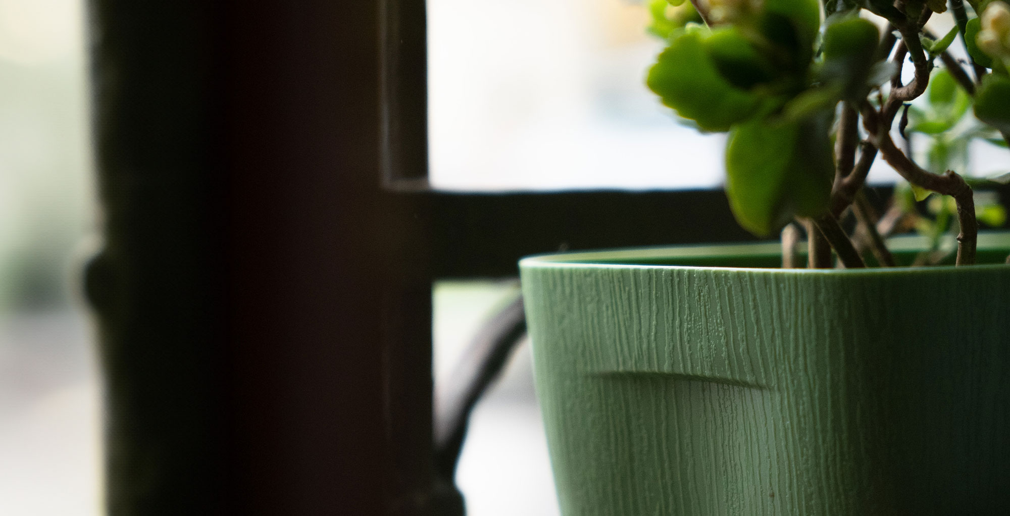
We, in our own way, have provided some answers to this question. The answer that gave birth to the Equa line is that the shape of sustainability can be a gesture: spontaneous, simple, and light. It is an action that adds value and imbues simplicity with meaning.
This is how Equa pots are born, with a distinctive mark that makes them easy to grip and a built-in saucer.
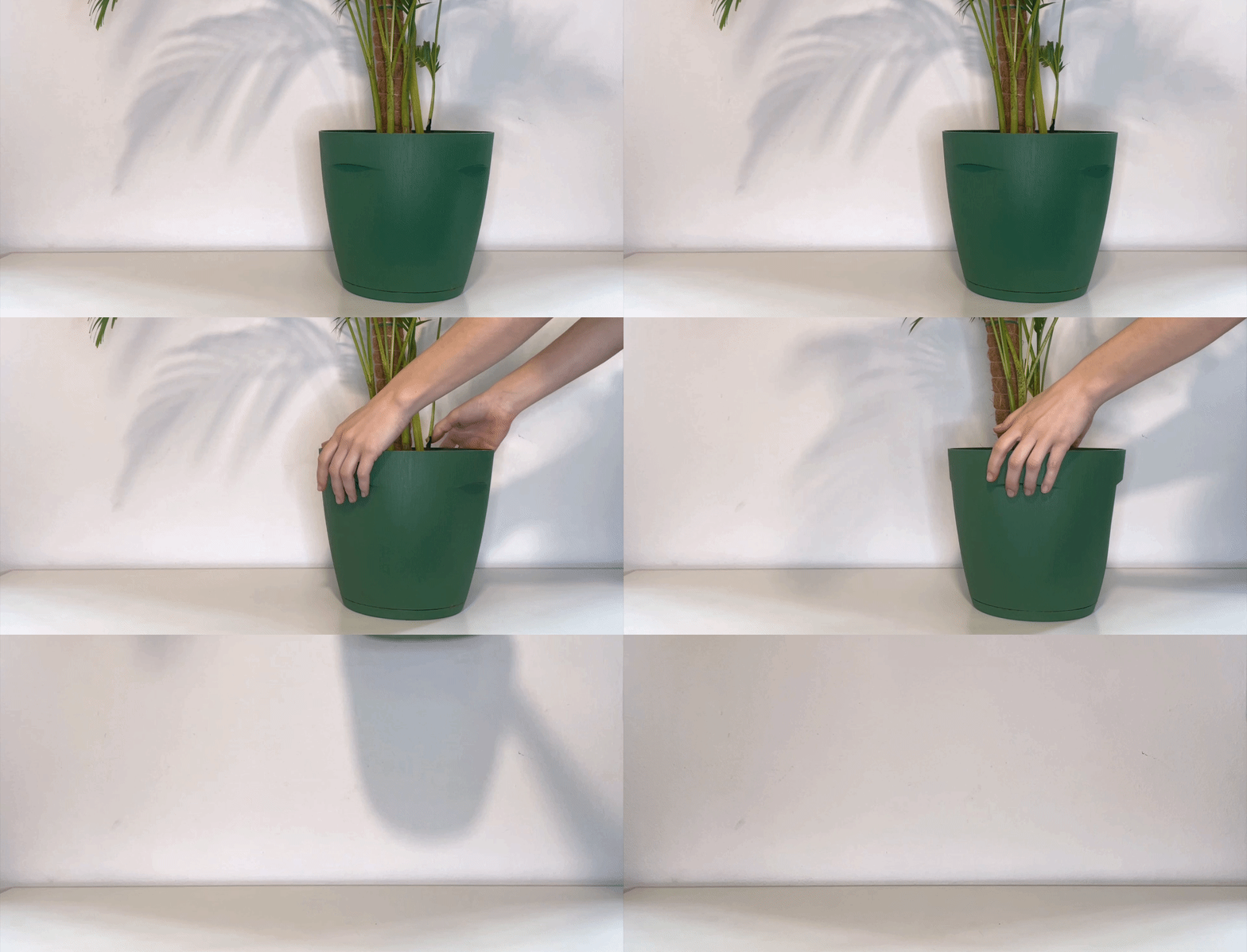
Visual identity
(05)
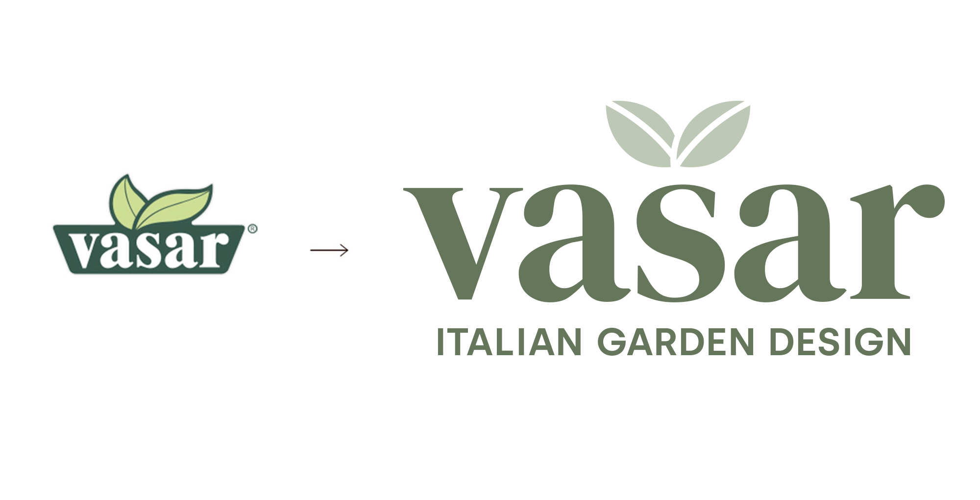
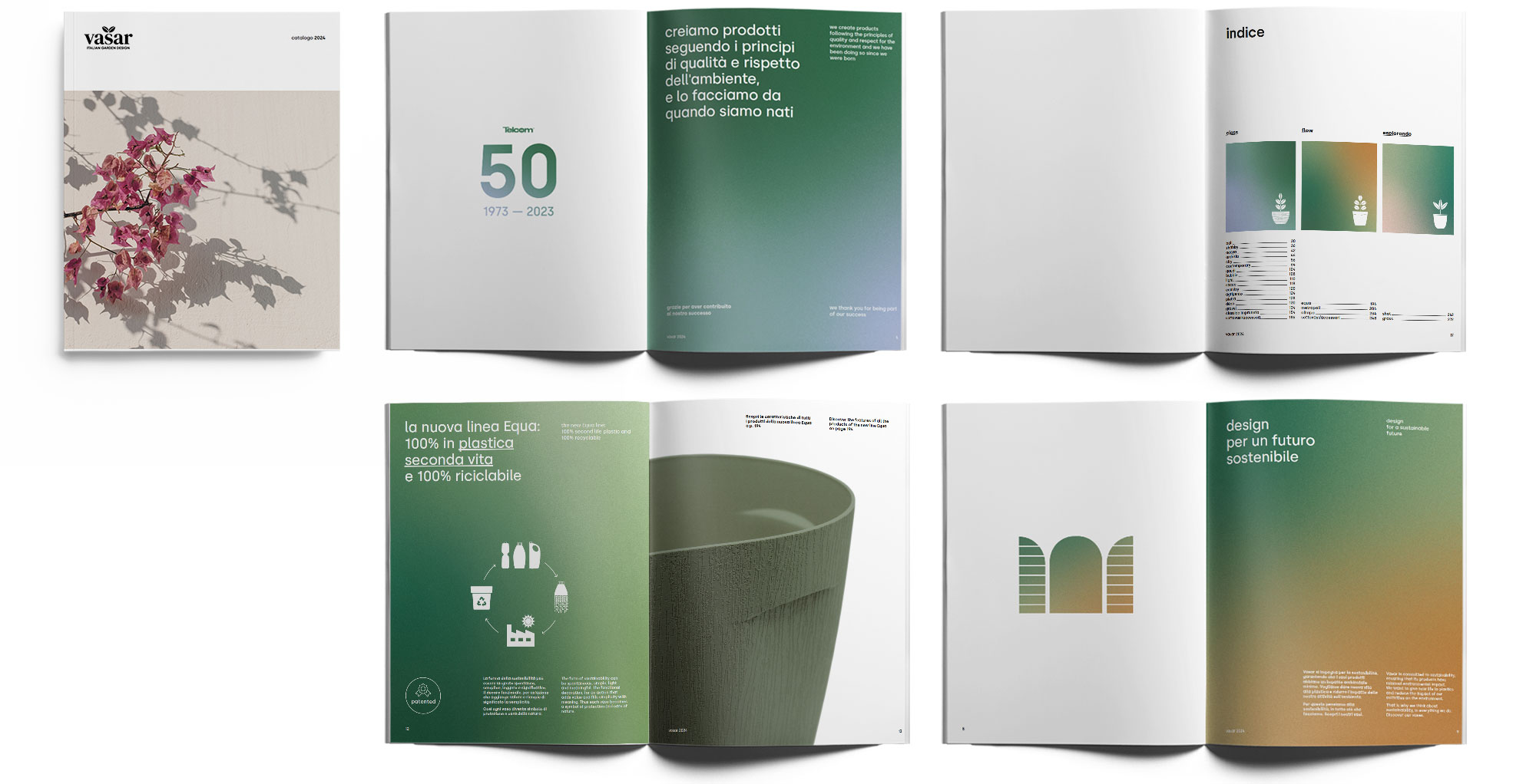
The first visual identity action was the logo redesign, which was streamlined and modernized without losing its recognizability and the impact it has in the market.
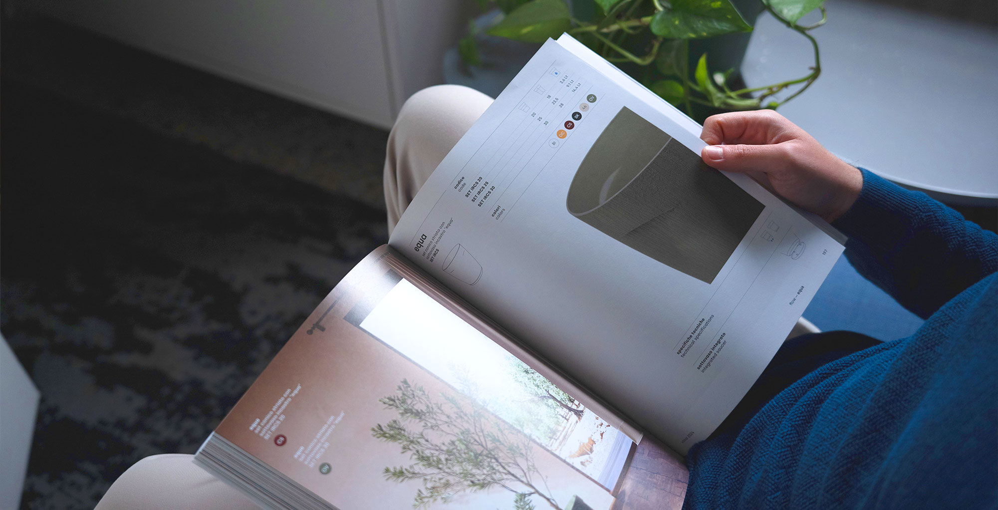
The next step was the creation of the new image and distinctive graphic elements for Vasar, all of which were compiled and translated into the design of the new catalog.
Equa line displays
(06)
Considering it was a new line and a significant change for the brand, every detail needed to be carefully curated, especially the display!
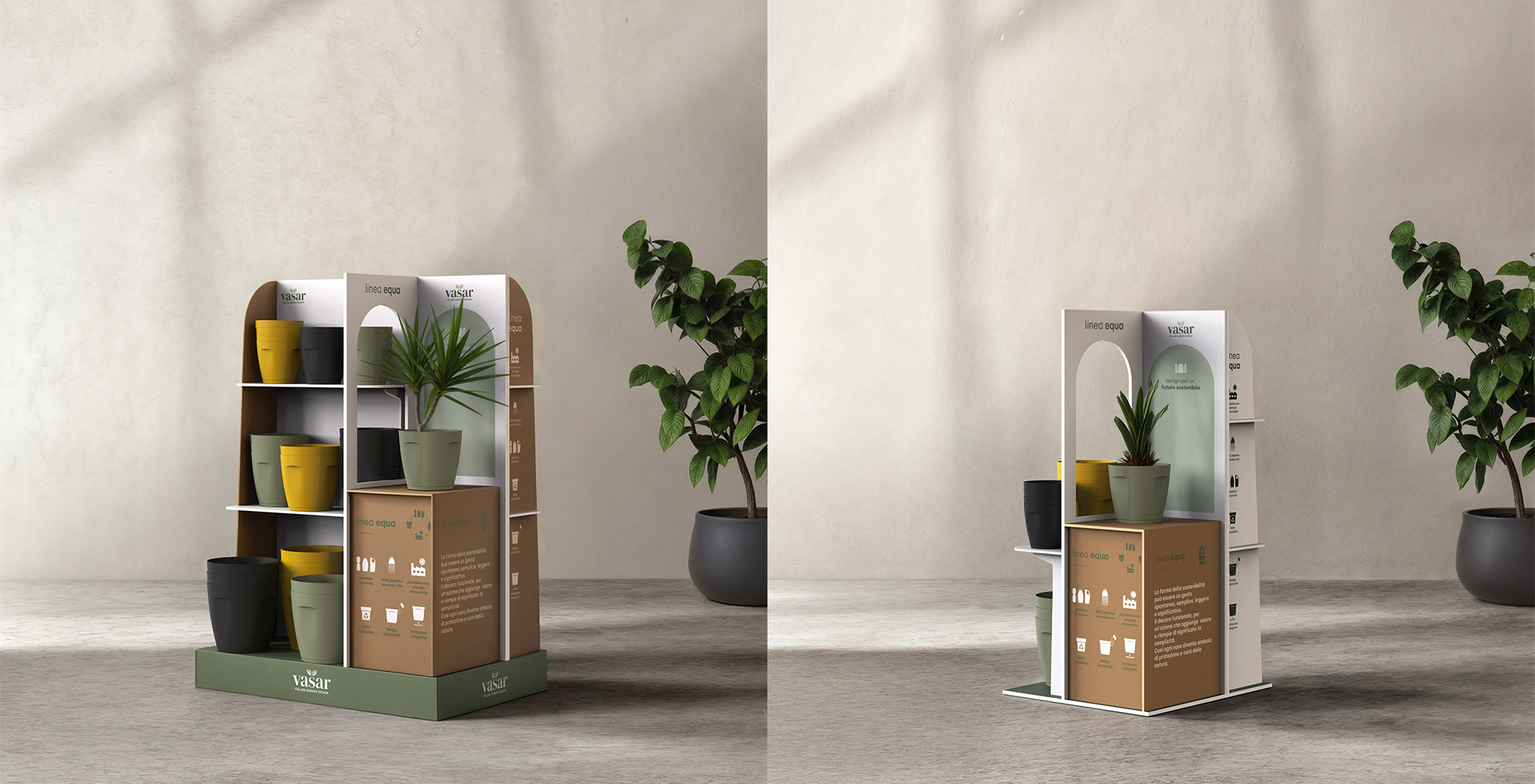
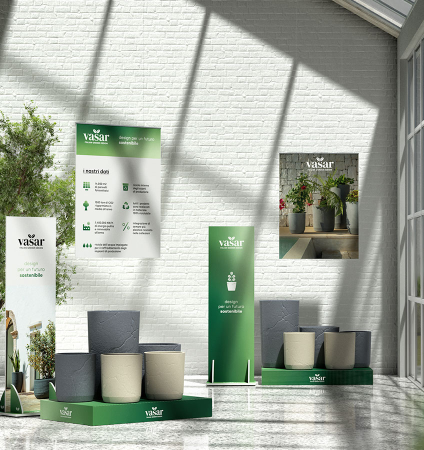
Hence the Equa displays were born with the goal of promoting the line off the shelf and making it known and recognized in the marketplace. The underlying concept is the creation of a constantly present display area where the vase is showcased and placed within a setting, separate from the storage area.
A window on the new Equa line.
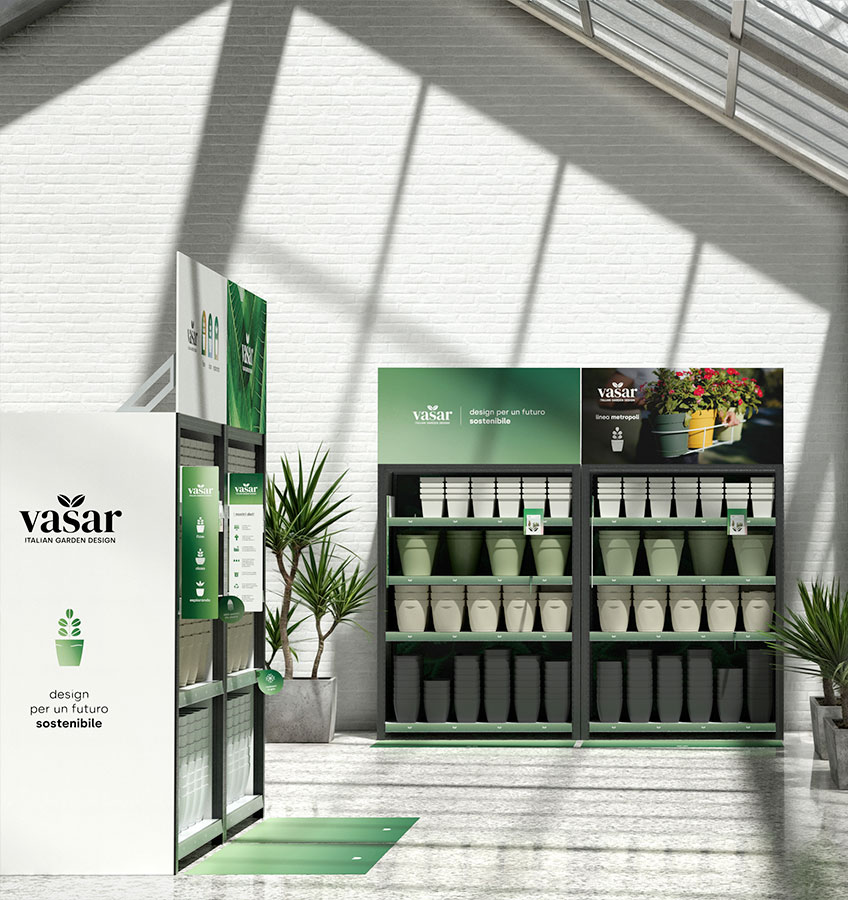
Vasar display system
(07)
Once the brand restyling was consolidated, it naturally had to be translated to every communication platform, especially at the point of sale.
Thus begins a lengthy and structured process of creating a coherent, comprehensive, and configurable display logic for each retail client.
Art direction and management
(08)
Vasar has been and continues to be a very important project for us, allowing us to rethink the brand in all its facets, always setting quality, transparency and consistency as primary goals.
Thanks to this wonderful collaboration with Telcom, the enormous trust they have placed in our studio, and the constant dialogue, it has been possible to create a successful rebranding.
Credits
Mockups, images, renderings: Nui Design Team
Photo: Vivi Spaco
Equa line rendering: Orygine

